Saturday, August 29, 2015

Domino's Thinks Emojis Could take Over!

The other day, I was watching TV and a Domino's commercial came on announcing to the viewers that you can actually order pizza by simply texting an Emoji pizza to Domino's. I loved it instantly and was glued to the TV until the commercial ended. I don't eat their pizza because it's not organic but I still have to salute them for this simple but yet effective idea.


I must say that they are doing a great job capturing the attention of the young generation. You know the teens and young adults who are their core customers. Most likely their core customers are growing up and moving into full adulthood. Which means that they are entering the work force and now can afford better and healthier food options. To appeal to the new young people, they have to use other means and trends that are current in the market. As a brand you must continuously tweak your campaigns depending on who you want to target.

The idea is a simple innovation and thinking outside the box. Below is the full commercial:


Due to new simplified ordering options like the one discussed above, Dominos has seen an increase of 12.8% in the second quarter. Therefore, following trends that make sense for you business should be encouraged as they will more likely increase revenue while gaining more return customers.

**In order for this to work, customers needs to register their phone number on dominos.com and opt in to receive text messages from the brand. After registering customers can then send the pizza emoji to DPIZZA (374992).

Bridal Shower


My sister's bridal shower was held on June 21st, 2014. Since I had decorated her traditional wedding, I knew that i'd be the one planning her bridal shower. It was a small baby shower with very few friends and a low budget. Here are some pictures with a bit of description:

Color: Black and white

Theme: Memories of their love story. 

Each wall in the dinning room had a set of words that symbolized their story. For instance in the below picture, the wall had these words: Love, St.Croix and South Bend, IN. During the final game, each guest had to tell everyone the soon-to-be married couple story from how they met to how he proposed using words found on the wall. 


In the living room, I just covered the table with a plastic cloth. Below are food choices for the event:


To save money, you don't have to custom make a cake. You can go to any grocery store and pick an already made cake. My go to place is Whole Foods, since it's organic and simply YUMMY. Anyways, I got this vanilla white cake already made from there. Since it didn't have any black on it, I decided to use some of the black M&Ms that I had bought from the party store. See the outcome below:


My sister was a happy bride to be. Everything turned out better than expected with low cost.


Wednesday, June 18, 2014

Where to Find Menswear Trendsetters: Pitti Uomo

Ahhh, Pitti Uomo is back (June 17th-20th). What exactly is that anyways?

Pitti Uomo is a bi-annual trade show that brings brands and buyers together under one roof in Florence, Italy. You find brands for both men and women's wear. The buyers buy trends that you will eventually see starting Fall 2014.  Since I have an obsession with menswear, I'll just focus on that.

This has grown into a street style maze. The thing I love most about this event, is that the stylish men are not all uniform. You get to see colors, accessories and crazy combination of outfits/fabrics.

Seriously, there's a style for every man. If you like the crazy look that gets people starring, you get that. If you are looking for the conservative look, you also get that.

I'm always in AWE with the unique styles I see here so it's best I share pictures.

1. The guy who's too cool to go formal 


by Lee Oliveira

2. The guy who loves colors and prints
by Highsnobeity


3. The guy who likes one statement piece 

by Highsnobeity


 4. The guy who's more on the classic side
by Highsnobeity


5. The guy who loves to accessorize 

by Highsnobeity


6. The guy who loves unordinary suits 

by NYT


7. The guy who loves his men bag/clutch

by NYT


8. The casual chic guy who loves a good pay of shoes


by NYT
9. The guy who goes for the less traveled road

by NYT

Which one is your fave from these looks?

Wednesday, March 12, 2014

Myths About Natural Hair

It has never occurred to me to talk extensively about hair until I did an interview with my good friend and mentor Jackson M'vunganyi from Upfront Africa (at VOA) aka Mr.J (my nickname for him). The show touched upon different hair textures and what it means to those that rock them. I thought I could expand a bit on the show and hash out all the myths about the whole natural thing.


1. It's too expensive

Ok i'll admit, before I went natural (meaning no more perming) I was freaking out. Millions of questions came through my mind and one of them was definitely the "expensive" part. The reason why I had this misconceived notion is because of all the numerous YouTube videos and blogs stating that you need a gazillion products and all kinds of protective styles for this to work. Honestly, I haven't done any protective hair styles such as weaves, wigs, braids, cornrows etc. since I started this journey. Well, I had braids once but that was more because I needed a change and not for the purpose of protecting my hair. I also have not used a gazillion products. You'll be shocked to know that I only use three products for my hair (shampoo, condition and hair cream). Hence, why it becomes affordable.

Tip #1: All you need is some good natural products, that don't have all the added chemicals in them. This will keep your hair healthy so that you won't need to buy a lot of products as well as spend even more on protective styles. Also, stop watching all those YouTube videos….you'll be more scared!


2. It's not Professional
It is very much professional. That is your natural hair that you were born with so how can it not be professional. The only issue would be adding colors to your hair depending on the field you work in. I've gone to many networking events and I have not been treated any different from the next person. Actually, sometimes it works to your advantage as people are intrigued and they want to touch your hair. 

Tip #2: You must know how your workplace is. I'd say minimal color and no headbands of any sort for a majority of industries (up for debates). 

3. You Won't Look Feminine
If you think you won't look feminine after going natural then there's a bigger problem that needs to be resolved first. Think to yourself: is my old hair the only thing that gave me validation of being feminine?  Here's a secret, you actually feel more feminine with the natural look. There's something to be said about you as a woman peeling your deepest layers to finally project what you were born with. You have shown your most vulnerable side to the world. That makes you feel feminine instantly. Take for instance, drag queens. Some of them have very defined manly features but honey when they get all dolled up, there's no stopping them.  They own it, every single bit of it. Then you get sucked in and you feel every bit of their femininity. 

Tip #3: Embrace yourself first, nothing more feminine that a load of confidence. Then focus on the way you dress and present yourself, the rest shall follow.

4. My Hair Is Coarse, It Won't Look Good

Ladies, ladies this is the beautiful secret about going nature when you have coarse hair. Your CURLS will be more defined which will save you that time you have to braid your hair every night. I fall into this category, it was the one thing that made me think a lot about embarking this journey. When I was younger I used to dread getting my hair done because it meant excruciating pain the whole time as the pulled my hair just to get a stroke of comb into it. However, I found out that it is the way you take care of your coarse hair that makes the journey more enjoyable the second time around. I love it and no I am not crying my pain away. So to my coarse-haired sisters, definitely go for it.

Tip #4: Get the right products that nourishes your hair. Then either wrap your hair with a silk fabric or get a silk pillow cover. This is a must, or your hair will dry up!


P.S: Coming soon. Products that I use not seen here and couple styles I've rocked. Stay Tuned.

Special thanks to Jackson for inspiring me to write about this piece and for our great interview on hair. You can follow him @UpfrontAfrica

**Feel free to comment about your hair and what it means to you. Really, anything you want to share about hair is welcomed!

Tuesday, February 11, 2014

Chocolate is Love

Place: Hotel Chocolat.

Location: 141 A Newbury St., Boston MA 02116

Highlight: Their impromptu chocolate tasting

This is one of my favorite Chocolate Shop in Boston. If you know me well enough, you know that I frequent Newbury St. a lot. I live for that area. I  could tell you where the different shops, and restaurants are located on that strip. Can you say obsessed?

Since Valentines Day is around the corner, I thought I'd mention this awesome place. Plus I love chocolate, like really love it. One of those 'I must have a piece a day' kinda deal.

1. Outside of Chocolate Hotel. At first you'd think it's a Hotel but it's not.


2. They now have a beverage stand where you can order a variety of chocolate flavored drinks. I mean I hadn't been there in a while so this was a nice surprise. On a business standpoint, this is awesome for them. It means more revenue and new customers that wouldn't have stepped into the store before.


3. They have occasional tasting. I particularly don't know how often they have them but I love surprises. Every time I have attended their tasting, it was random. Here's their recent tasting: Caramel Cheesecake Selector (last picture), Eton Mess Selector (1st and 3rd pictures), and Pink Champagne Truffles (2nd picture). The truffle was all I remembered, just delicious!!!!!


Eton Mess, Pink Champaign Truffle, Caramel Cheesecake

4. As I mentioned before, they have a lot of different flavors to satisfy any chocolate lover like myself. On this display are:
a. Love-me-do Passion Fruit Truffles
b. Love-me-do Raspberry Fusion
c. Love-me-do Strawberry and Rose Truffles
d. Champagne Truffles-White
e. Champagne Truffles
f. Pink Champagne Truffles
J. Kir Royals
H. Champagne Truffles-Dark


5. I didn't want to give everything else away. As they have other products that are chocolate flavored like 'Cocoa Pasta.' You have to go there for yourself to see it all.

If you haven't decided what to get for Valentines, I'd suggest checking this place out. Their packaging and flavors are truly unique. This will definitely hit that one special person's heart. You can thank me later :)


Tuesday, February 4, 2014

My Top 5 Pick Of Super Bowl Ads 2014

I get excited about the Super Bowl for one thing THE ADS. Most of the time as marketers, we are not given much attention. This is our little playground or the master show. However, I always get disappointed. Ads shown during the game are suppose to be mind-blowingly creative. Come on that's when we get to impress the big guys (doctors, engineers etc.).

Anyways with that said here are my top 5 pick that were good but not "How did you come up with that?"face. Also, this is just my opinion!

5.  U2 "Invisible" Bank Of America (Red)

They were couple things in this ad: 

1. Celebrity endorsement: U2 team up with BOA
2. Cause marketing: BOA teams up with (Red)
3. Co-branding: Brand awareness of both BOA and (Red) is achieved
4. Music marketing: Free download of U2 song= marketing, creating that buzz and WOM

This ad would take the whole post for me to dig deep into all the strategies and how they are related. Feel free to comment below if you want more details.

Their goal: Definitely branding and generating sales

What they did right: The combination of U2 with an urgency to download their free song for a good cause is like no-brainer right? People want to feel like they contributed to a good cause.


4. Coke 

If you didn't know this, I'll repeat it. I love love love Coke. The only brand I am super loyal too. One of the reasons is because they have lots of creative strategies despite the fact that they are the #1 soda beverage in the world. Find me on a good day and I'll explain my obsession with this brand.

Their goal: Branding….just so you don't forget them

What they did right: Use an iconic song that was sang by different ethnicities of America.

If you go down in history and look at past Coke ads, you'll quickly learn who they are and what they stand for. You know iconic songs and events around the idea of sharing or unity. They didn't disappoint again and they don't care much about the backlash from the contrevorsy either. That's the epitome of "Brand Consistency."


3. Axe

Axe is usually known for their over sexualized ads in order to relate to their audience (mainly young adults). Why is it that they are getting away from that? Maybe...

1. They got tired of the whole "sex sells" thing or it wasn't bringing enough ROI or
2. Their core audience is growing up 

Their goal: Re-branding….Shifting from the "sex"appeal to more of the idea of "love" for their brand.

What they did right: Make people choose "love" through the use of stereotypes and political conflicts. 

This worked, it's like seeing an immature young man, suddenly all mature and responsible. I hope they keep going this direction, they definitely won more respect as a brand from me.


2. Budweiser

Budweiser is a beer, I think we all know that. But did you see any beer bottle/cup in that commercial? Right, just checking. 

Their goal: Increasing women usage of Budweiser consumption

What they did right: Using animals to unite two people with some soft music.

You know us girls, hit us with an emotional friendship/love story and our hearts are glued to that TV. Plus, who doesn't love animals. Maybe you've never noticed but a lot of Super Bowl ads usually include animals, because as human beings tend to relate to them better. 


1. Cheerios

Last year Cheerios introduced the ad with the little girl and her black father. People sent hateful comments about the interracial part. That didn't stop Cheerios from coming back swinging even harder by introducing a little brother and a puppy. Brilliant move!

Their goal: Branding and segmentation (or more like reaching out to overlooked markets like the African American community)

What they did right: Taping into the one of the main hot topic in America. You know, shacking people up a little with the black and white thing. 

Plus did they just introduce the concept of skits. Where ads will now become sequels too. I think that's a great trend. You'd hook those loyal customers with endless stories.

 I personally can't wait to see the baby brother! 


Again emotions, kids, animals, and celebs seem to be winning this ad thing. But on a serious note, ads are ought to be more creative. To get people talking for months after. Plus no one wants to be burning through 4millions in 30 secs. My thoughts, feel free to share your own below. 


Wednesday, January 29, 2014

Best of 2013 Music Marketing Part 2: Miley Cyrus

You probably think I am crazy for including Miley Cyrus because "She's so bad." Hold it there tho, give me a chance to explain. Miley Cyrus, like many celebrities that grow up in the entertainment business, was getting older and so were her fans. The truth is, sweet Hannah Montana had to die for Miley Cyrus to be seen as a young adult as well as relate to her core fans. Now, how else do you think she would have done it without all this so called "rebellious" behavior. To me, this is more of a well calculated marketing strategy of changing her brand. Let's take a road trip to how this unfolded:

1. Twerking Video (March)

In March, Miley released a twerking video wearing a unicorn onesie dancing to "Wop" by J. Dash and Flo Rida. This became an instant hit as different news outlets and celebs were tweeting about it. Beyond that, her fans went crazy with the #Mctwerkteam hashtag. Plus let's not forget how, all of a sudden, young people were twerking away and sharing their own videos on Youtube. Because it was 'cool' to twerk. I almost forgot to mention that young adults also raced to get their own onesie. I am guilty of it, although I am still searching for the perfect one to purchase.


2. In August MTV Music Video Awards (August)

What do you remember about last year's VMAs? I, for a fact, can only recall the 'Miley twerking on Robin Thicke' scandal. But wait, was this really a scandal or a brilliant move towards her revamped personal brand? I can assure her team was aware that everybody would be buzzing about it. Also, her outfit became the hottest Halloween costume last year.


3. Wrenking Ball Video (September)

In September, she released the "Wrenking Ball" video and lots of people raced to the Internet to watch it. Why? She was hanging on a wrecking ball naked and crying. Personally, I wanted to see how much she had pushed the conventional button. She achieved what she wanted as the video reached 100million views in just 6 days. This video broke the Vevo record of 'most viewed video', that she previously held.


4. The Rolling Stone Cover (October Issue)

Now let's talk about that hot picture on the Rolling Stone magazine with her tongue sticking out. A symbol she has created to go with her new brand. If she wasn't on top of her game, then why would one of the BIGGEST magazines feature her?


5. Free The Nipple (December)

In December, she tweeted a picture of herself holding a fake nipple in support for "Free The Nipple" campaign. The organization aims at "decriminalize the female body" and "protest the backwards censorship laws in the US via Huffingtonpost. Celebs always associate themselves with a particular cause. For her, this NGO goes hand-in-hand with her brand. The side that is more rebellious and free from society's norm.


The buzz created around Miley's brand is different from Beyonce's. One is an iconic figure and the other is a person who is growing out of her child brand. The buzz surrounding Miley focuses on events that are more crazy and rebellious in order to make a statement. If you look through history a lot of female artists that started young went through this faze in order to adopt to their changing environment. Buzz is created differently depending on the client's goal. In this case Miley's team did a great job because everywhere you turned Miley's name was mostly at the top. Plus at this point nobody remembers poor Hannah Montana. 

Sunday, January 5, 2014

Best of 2013 Music Marketing Part 1: Mrs. Carter

We all know that the music industry is saturated and getting any meaningful attention is pretty darn hard. But Bay and her PR team are well aware of that. You don't believe me? Read below:

1. The 2013 Superbowl

We all remember that epic performance during half-time at the Superbowl with the appearance of Michelle and Kelly. However, the buzz making part was the creation of memes using unflattering picture of Mrs. Bay herself. It was a nightmare for Bay's publicist who was trying to get them off the Internet but I personally wouldn't have tried to do so. Come one, there's something to be said about flaunting your flaws, right?


2. The HBO Documentary

The Life is But a Dream documentary debuted on February 16th on HBO allowed for the world to see Blue Ivy for the first time. She could have done the documentary without Blue but then there would be nothing shocking or unique there. Blue appearance was a buzz maker since everybody had been awaiting for this moment. Plus you must admit Blue actually doesn't look as bad as people were speculating, if you know what I mean.


3. Beyoncé New Face of H&M

She became the face of H&M in April. Anytime an artist teams-up with a notable brand it's usually a win-win situation for both parties. Beyoncé showed her curves, which would get immediate media buzz.


4. The Mrs. Cater Tour

Yes, she went on tour this summer but that's not the most important part. Remember when she photobombed a fan during her concert. Between her and her publicist, I am sure they knew the trend photobombing was causing, so why not part-take in it. But wait, it had to appear natural, like an after thought. Current events and trends get talked about that's why this was a mega hit.


5. Instagram Pixie Cut

The power of Instagram, you can't deny that. But really, remember when Beyoncé posted a picture of her new hair due in August, a blond pixie cut. Yet another buzz maker that had everybody talking. She didn't have it for long either, so why? Well, I am pretty sure she wanted to divert the attention Miley was getting, with her endless twerking and tong-wagging, back to herself. Because, she's the Queen!


6. End of Year Surprise Album Release

Now the bomb dropper, the cap that sealed the 2013 in the music industry, the Self-titled album itself released December 13th. Thanks to Bay now music consumption and distribution will have a different meaning. Most importantly 80,000 copies were downloaded in the first 3hours. I am not even a fan of Bay but this one was epic and kudos to her PR team because every media outlet was talking about it. I hope the team drank champaign and got treated to a long vacation!


A lot more went into planning Beyoncé's brand image this year than I could talk about. But at least you get a sense of how PR professionals creates buzz making events for their clients.Think about it why didn't Bay keep quiet all year and only make noise with her "Self-titled" album? Unfortunately, the competition is stiff and one big event is not enough to maintain a personal brand. As an artist, you MUST create a yearly calendar of major events that will create BUZZ around your brand image. Or hire a PR team/person to do so :)

**Creative Ideas= Buzz= Awareness= Sales

Sunday, December 1, 2013

I can see the World View!

For a while now I've been seeing the new Economist campaign "World View" in train stations around Boston. They had couple ads displayed in different places (will go over three of them). These ads reminded me of the "Big Idea" class as well as my beloved Prof. Tucker. As I was looking at the ads, I remembered him saying "print ads have to be visual, simple and at the same time convey the Big Idea you're going for." I can tell you the Economist nailed all these points.

Their BIG IDEA: emphasizing the "World View" through ordinary objects to get new readers.

According to Advertising Age, they wanted to target college students and they chose Philly and Boston. Why Boston? Well, the city is one of the most Affluent in the US. Largely due to high ranked Universities, well-respected healthcare system and being one of the main technology hubs.

Now let's focus on the ads themselves so you can understand why I thought they were brilliant and straight to the point.

1. The Binoculars 


You know the binoculars are used to see things that are far closer. I mean how great does it go with the worlds "World View." The also used their own print as the binoculars. With this, you don't have to read the texts below to get the message. Very catchy!

2. The Globe


The globe is an iconic object that can be found in all places of the world. Again, you have a huge image overpowering the whole sign. You must ask yourself without the worlds at the bottom (and only the logo) will you understand what this ad is trying to convey? If the answer is yes, then the ad is accomplished what it was suppose to do. Catch your eyes, and send you the message in quick seconds. Nice!

3. Rubik's Cube


Rubik are often associated with intelligence because it takes strategies to finish the game. The combination of the world view and solving the Rubik sends a strong message. You could read it as The Economist solves your curiosity about what's going on in the world. What do you think?


TAKE NOTES:

1. Have an image that can tell the story by itself
2. Have a "Big Idea" so that your ads can convey the same message in different ways
3. Remember the branding part. Meaning if people see the ad will they recognize the brand?
4. Don't beat your head against a wall to get a crazy out-of-this world idea. Look around you, what's ordinary that you can use.
5. Also don't forget about Simplicity. It doesn't have to be an orchestra type of deal.


Sunday, November 17, 2013

All Jazzed Up at Beehive!

Restaurant: The Beehive

Location: 541 Tremont St Boston, MA 02116

Highlight: EVERYTHING!

This is officially one of my favorite spots in Bean Town. Once you have live jazz I am sold. However, at Beehive it's beyond the the jazz. They have a great all around atmosphere. The waiters have a unique dress style i'd consider it a bit hippish but modern. The prices are great considered the fact that they offer free live music. Their Saturday brunch is from 10Am-3pm (music ends around 2:30pm).


The other reason why I love this spot, is the FOOD. You know that's always a deal breaker. Seriously the food is de-li-cious. I've been here twice and I've been more than satisfied with the options. This time I got a vegetarian omelet (with zucchini, tomatoes and cheese) which came with a salad (very lightly seasoned), bread and fries. I just love how they cut their fries, on a first look you'd probably think that they were bacons. Also, if you're a tea person get their African Red tea. I had it with lemons and honey, just amazing! For almost 5 bucks, trust me it's worth it. You actually get a little pot, so you end up drinking about 2 cups and a quarter. Plenty for your satisfaction :)


Sunday, October 27, 2013

It doesn't Bite!

One day as I was browsing in Sephora, I came across this Bite mini lipstick set (seen in the picture below). One side has the red "Pomegranate" and the other side has the hot pink "Vital." The side I am showing is the Pomegranate color.

Reasons why I love it:

1. I actually purchased this mini set due to the fact that it is on the natural side, since I try to take that route with my beauty products as much as possible. The brand stays away from chemicals such as synthetic dyes, parabens and fragrances. Bite focuses more on natural ingredients like organic fruit butters, Manuka honey and organic oils. 

2. I love the fact that the color is vivid and true to its look. Meaning what you see is what you get when you put it on. You know when sometimes you put on a color say "red" and the red doesn't show on your lips the way you want. So annoying!!!!

3. A lot of other lipsticks you find are dry (like the MAC brand). Most of the time you find yourself adding lots and lots of lipgloss to smoothen your lips. But not Bite, all you really need is your regular lip moisturizer before applying the lipstick. No need for lipgloss!

Pomegranate Bite Lipstick


Tips:

1. You MUST moisturize your lips before putting on your lipstick. You can't skip that stage, like EVER! Hope I scared you into this habit :)
2. Apply as little or as much to get the right shade of color you are going for. In this picture I applied a bit since I didn't want the vivid red. 


Have you tried Bite lipstick? Or you have another brand you like? Leave a comment below!

Sunday, October 20, 2013

Event Planning: Rwandan Traditional Wedding

It was such a pleasure to help coordinate my sister's traditional wedding known as "Gusaba" in Kinyarwanda. As I don't know all the meaning behind the Gusaba itself, I have taken a paragraph from the program given to those who were not Rwandan, during the ceremony, in order to get acquainted with the tradition.


Gusaba means “to ask” in Kinyarwanda. It’s the ceremony where the “Umuranga” (the bachelor’s representative) officially requests for the daughter as a bride. The Gusaba is a battle of wits often involving traditional tongue-twisters as well as riddles and pranks from the girl’s side. The family of the would-be bride, as well as the people of her neighborhood, were all consulted as the welfare of children, even in marriage, is the responsibility of the community.


For further information about Gusaba and all the other traditional ceremonies please visit Akaliza's blog.

I was in charge of the decorations. The colors were burgundy and celadon (which I learned of that color during the wedding preparation). The decor had to look a bit traditional but yet whisper 'uniqueness'. 

A. Bridal Party Area:
The stools the groomsmen and bridesmaid sat on where the black ones you see below. Obviously these are not the traditional wooden ones, but our decor had a more modern twist to it. Then the bride, groom, made-of-honor, and the best men sat on higher wooden chairs (they usually sit higher than the rest of the bridal party, as seen in the picture). 


Here's a closer look at the bridal area decor:
1. The wall decors was made from 3 long wooden stands covered with "Umusambi." The two  wall decor with geometric shapes are actually made from cow dung (no, worries you can't smell it). 
2. On the floor,  we had 3 narrow baskets filled with staple foods from Rwanda. There were tomatoes, potatoes, sweet potatoes and green bananas (my personal favorite). I added a green material to go with the decor.
3. On each side of the center table we had traditional brooms which were painted in a burgundy color. 


4. These below represent the man and woman side. 
a. The woman's side: It has a traditional calabash called "Igisabo" which is a must have house item for a Rwandan woman. It is very sacred and must not break. Women used to make "kaffir" milk, butter, lotion in the "Igisabo" back in the days. Next to it are cups that were used for milk consumption.

b. The man's side: The two small calabash called "Agacuma" were used by men to drink traditional beer "Urwagwa." The drums have always been used by men and are an important part of our culture. Drums were used to tell stories as well as let men express themselves. Men usually carried the sticks you see below. One is made out of cow skin and the other from small beads.


c. Then there was the centerpiece on the bridal party table. My sister wanted the decor to revolve around fruits and vegetables. Since the centerpiece had to be low, I went with a single watermelon. I'd have to give it up to sister M and cousin R for enhancing and crafting it further.


d. This is one of the small tables next to the bridesmaids and groomsmen to set their drinks on. I just put gold napkins, one small rwandan basket, and green star-shaped papers (that I bought from a craft store).


B. Drink Area
Unfortunately I was running around so I did not get a chance to capture the decor for the drink area. But the picture below will show you a glimpse. I used round woods and painted the outskirts with burgundy paint. I then attached a celadon ribbon on each wood. For the writing, I first used a pencil to write the beverages that would be served, then I re-traced the pencil with the burgundy paint to avoid irreversible mistakes. 


C. The two VIP tables (one on the groom's side and another on the bride's side)
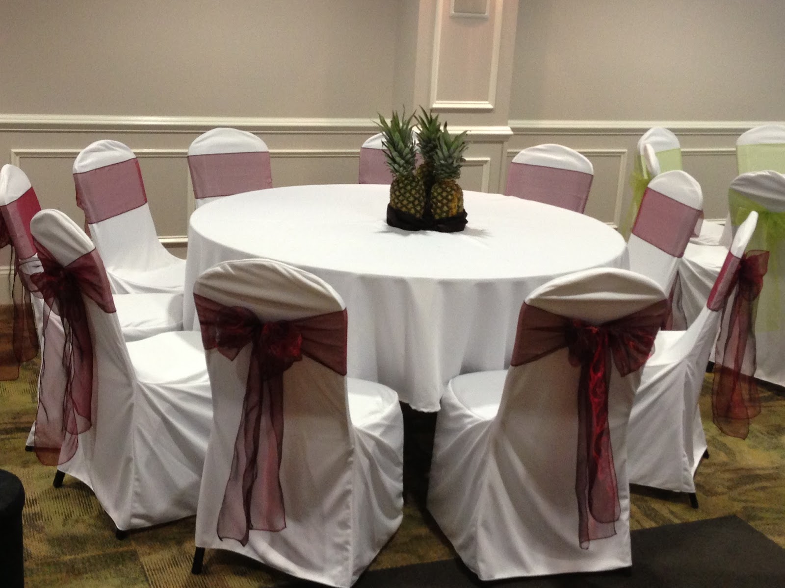
1. I went with 3 pineapples, then I added a dark brown cloth around them for support as well as blend the colors well (this was a last minute decision).


D. The rest of the tables
1. I used the woods below and painted the top part with burgundy paint and then I covered the side with the green cloth (shown below). I also added a burgundy ribbon around the green cloth to pop up more. Inside of the woods, I put different crops produced in Rwanda. Then in the middle I added a vase filled with limes (about 8-10 each). There were 8 wine glass shaped vases and 9 squared vases.

a. Props I used for centerpieces


 b. Coffee filled wooden container. Coffee is one of the main revenue generator in Rwanda. Starbucks , Bourbon Coffee, and several groceries store do or have carried it. 


c. Beans filled containers. Actually we had 3 containers with beans in them. Why? Well it's one of Rwanda's staple food. I can't begin to tell you how often we ate beans at home.


d. Soybean filled container. Soybean is another staple food. The others we had were corn, rice, sorghum, peanuts etc.


e. Here is the final look of one of the centerpieces.


E. Outside decor
We just had traditional baskets on the stairs. These baskets are hand-wooven by the women in Rwanda. It is the main source of income for a lot of these women who survived the genocide (a lot of them being widows).


F. The CAKE!!!
Yum, that's my favorite part. I knew the cake would come in brown, beige and black colors. These flowers you see had to have all those colors including red and green which were the main "Gusaba" colors. The cake itself was made by Oakleaf Cakes in the shape of "Inkangara" a large basket that was used, back then, to store crops.


Sorry guys this post is late and super long but I hope you do enjoy the pictures and the read. Special shout out to my sibling and cousins that helped make this even more gorgeous :)
Also thank you to Mr. O for taking these great pictures! 

P.S: If you need help with your decor for any occasion please contact me at delytwined@gmail.com